Logos
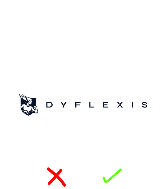
Use the white logo on a dark background and the dark logo on a light one. This ensures visibility, contrast and brand consistency.
Please note: the white and dark versions are two separate designs, not colour inversions of each other. Always use the correct file and don’t alter the colours yourself.

Fonts
We use three fonts, each with its own role. Use Syne for your most important headings, the ones that need to grab attention, and Big Shoulders for secondary headings and subheadings. For small headings, use DM Sans Bold in capital letters, and DM Sans Light for body text.
Colours
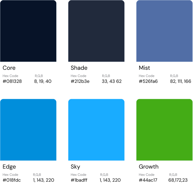
Build your design around our three primary colours:
Core: as the dark base.
Shade & Mist: for flexibility and depth.
Edge: as an accent for anything that needs to stand out.
Sky: text and hyperlinks for optimal readability on a dark background.
Growth: To enhance readability and for differentiation.