

Tableau
Connect Tableau to Dyflexis and your workforce data stops being a spreadsheet and starts being a story. Clear, visual dashboards that show exactly what is going on with your labour costs and staffing. All at a glance, for everyone.

Benefits of the integration

 Spot the trends hiding
in your workforce data
Raw numbers tell you what happened. Tableau shows you why. Interactive visualisations make rising labour costs, peak hours and departmental anomalies impossible to miss, without having to hunt the data down yourself.
 See what your team
actually costs, in context
What does your team cost on any given day? And how does that measure up against your budget? With Dyflexis and Tableau, labour costs always sit alongside your occupancy figures, revenue and operational goals. The full picture, not just a part of it.
 Dyflexis in one overview
with all your systems
Tableau works across virtually any system. Link your Dyflexis data to your PMS, your financials or your revenue figures and build dashboards that show the complete picture. You are not steering by individual KPIs, you are steering by how they all fit together.
 Get ahead of problems,
not behind them
Are labour costs consistently running high relative to revenue? Are certain days or departments regularly understaffed? Tableau surfaces those patterns early, so you are always acting on what you can see coming, not reacting to what has already gone wrong.

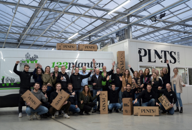
PLNTS about BI-tooling
“Dyflexis is connected to Nmbrs and our BI tooling. This allows us to automatically synchronise and process data.”
Jesse Mostert, Founder of PLNTS
Your integration with Tableau
Discover what’s possible for your organisation and take the next step towards a seamless integration.
* These fields are required.